I'm having Tavis Highlander develop a new logo/shirt design and this is what he has come up with. There are 2 versions, one has the Large G on the background as grey, the other has it as red. I prefer the red as it ties into the text logo that's on the front. What do you guys think?
I'm a little up in the air on the "L-G" as the background on the back of the shirt. I think it makes for a clean background, but I'm open to input. And yes, it's a little narcissistic using my own car, lol. Ultimately, I'd like to do another version with another car, perhaps having a series using different makes/models of cars.
Anyways, I wanted an updated design that would represent muscle cars, performance, handling, driving, etc... get the vibe of our community in one easily identifiable image/design.
What say you?


 Brian Hobaugh SCCA National Tour June 2014
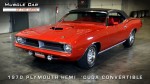 First Hemi 'Cuda Convertible Ever Built
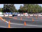 Short clips: Goodguys Pleasanton autocross and pit videos


 Linear Mode

