I have a little father/son project and would like some opinions on the initial paint scheme. Like or dislike colors, stripes, etc. Things you might change.
I like where to paint lines break up, but I would make the stripe smaller and get rid of one of the colors: yellow or red. I think the yellow in a smaller stripe with the same theme would look good.
The current paint stripe reminds me of the show cars in the 80's and early 90's. I like the looks of those wheels
i personally am into the restomod look myself.. OEM colors and no stripes or at least OEM style stripes, then some big wheels and lowwww.. Never been a big fan of stripes and two tones on early camaro's.. i have seen some that look good though. Bad Penny is a good example of what i like, just clean and one color. Something along this style, not a camaro I know, fesler has some killer builds on the website..
I like where to paint lines break up, but I would make the stripe smaller and get rid of one of the colors: yellow or red. I think the yellow in a smaller stripe with the same theme would look good.
The current paint stripe reminds me of the show cars in the 80's and early 90's. I like the looks of those wheels
I like it. Do you have a rear 3/4 view of the rendering?
__________________
______________________________________________
1969 Camaro/ Tom Nelson TT 434 / Wayne Due C5 / DSE QLink / and a bunch of other stuff...
I like the two tone, but I think I would use different shades of colors to split it up, variations of silver, matte blacks, etc., to make the split more subtle, and less "in your face". Looking good dude
I like the two tone, but I think I would use different shades of colors to split it up, variations of silver, matte blacks, etc., to make the split more subtle, and less "in your face". Looking good dude
Yep, Kris is working on some different shades. Good feedback.. I don't have the rear 3/4 view yet..
I'm surprised no one's picked out that paint scheme yet. It's basically the exact same one that's on Foose's 2010 Mustang that he did with Mothers. David asked me to try that scheme out first and to build from there. We'll be changing the layout and the color scheme to be more unique shortly. The yellow/red really isn't a very appealing combo and looks really dated in my opinion, so we're going to try some more subtle colors next. I'm sure more renderings will be posted soon!


 Brian Hobaugh SCCA National Tour June 2014
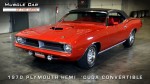 First Hemi 'Cuda Convertible Ever Built
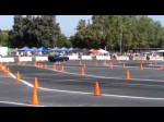 Short clips: Goodguys Pleasanton autocross and pit videos


 Linear Mode

